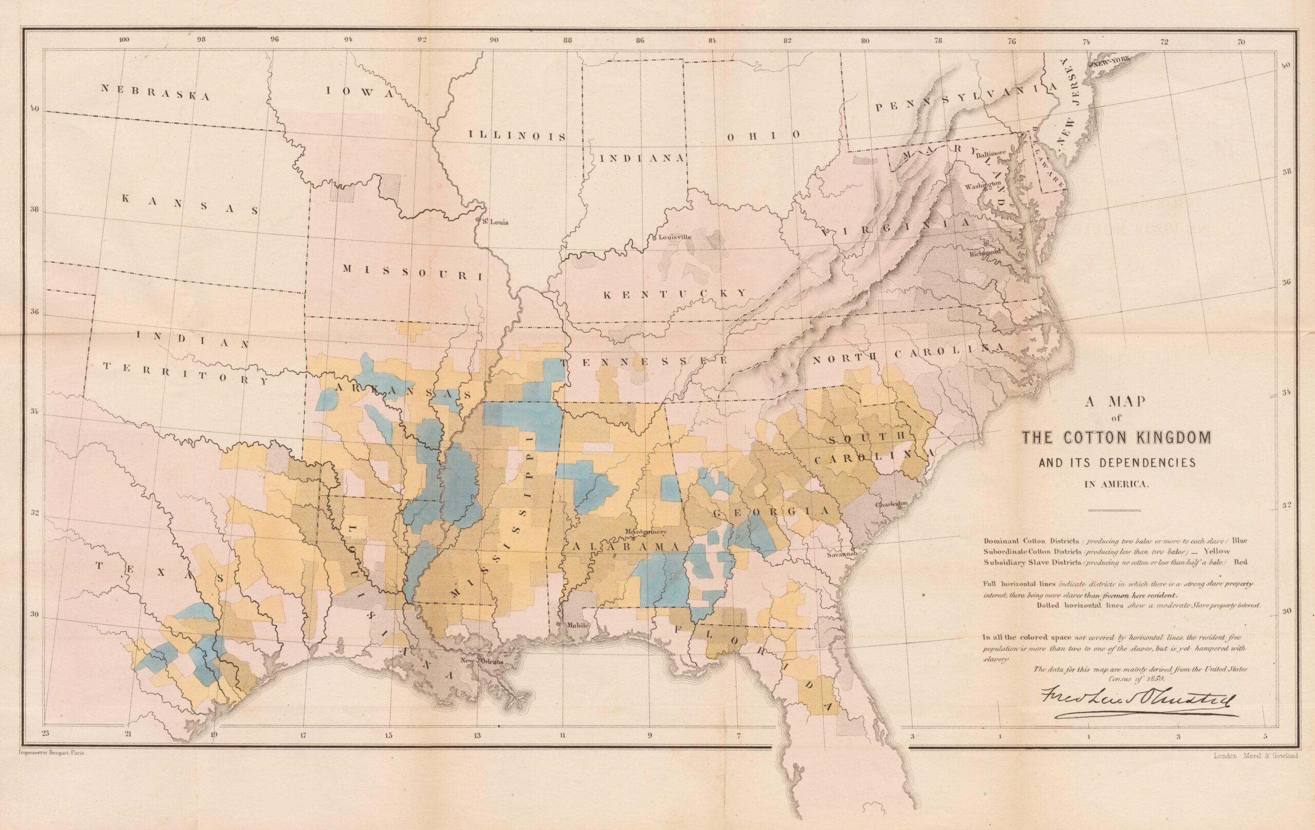
This map by Frederick Law Olmsted was published in 1862, during the American Civil War.
During the American Civil War, the Union side completely blocked to the south, preventing any commercial exchange. As a result, cotton producers and merchants in the southern states began to persuade their British trading partners to exert pressure and break the blockade. Among their strategies, they insisted that the freedom of the slaves who sustained the cotton plantations would substantially increase the price of cotton.
This map was the North's response to combat that propaganda. The map shows the counties with the highest cotton production in blue, those with average production in yellow, and those with very low production in pink. In addition, black horizontal lines shade the states with a high slave population. With this data, Olmsted sought to show that most counties producing large volumes of cotton did not do so thanks to a large slave population.
The reality is that the price of cotton increased more than fifteenfold during the American Civil War due to the trade blockade, but after the end of the war and the abolition of slavery, the price of cotton plummeted and remained below its pre-war level for more than a decade.
Sources

