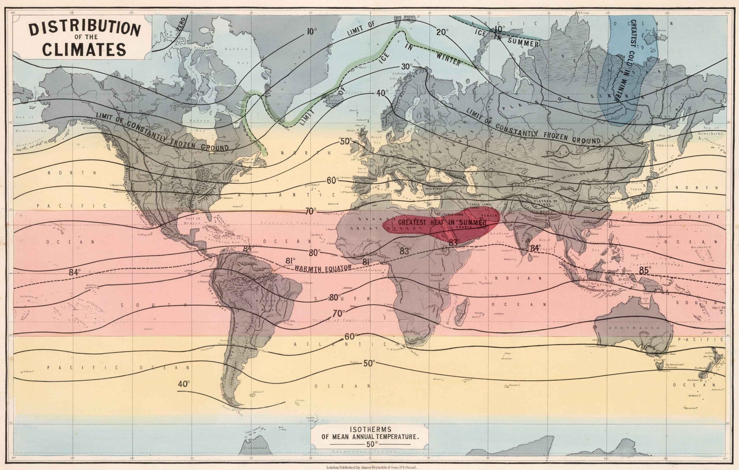
This map, published in 1862 by James Reynolds, shows the distribution of climates around the world, at least according to the understanding of climate that existed in the mid-20th century.
The map is crossed by a series of isotherms, which determine which points on the globe have the same average temperature. Temperatures are expressed in Fahrenheit. For reference, 80 °F is equivalent to 26.7 °C and 20 °F is equivalent to -6.7 °C. In addition, the map includes coloured bands representing different latitudes: red for equatorial, yellow for intermediate, and blue for polar.
There is also a green line at the top, representing the extent of the Arctic ice shelf in winter, and a blue line showing the retreat of the shelf in summer. In addition, the area with the highest summer temperatures is marked in the eastern Sahara and the Arabian Peninsula.
Sources

