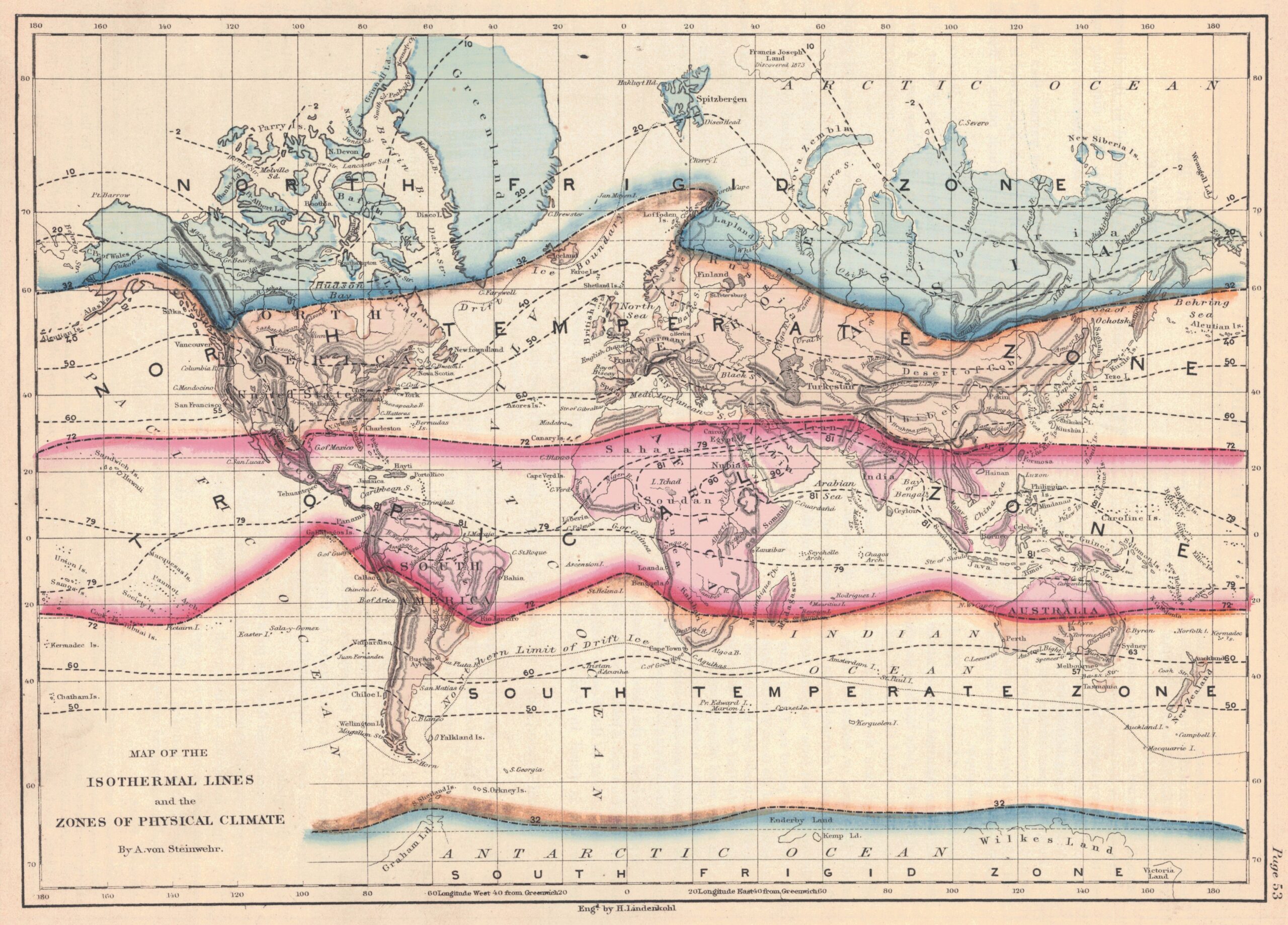
The original version of this map is part of a treatise on physical geography published by David M. Warren in 1860. More specifically, this version of the map corresponds to a reprint published by Adolph von Steinwehr in 1873.
This is a map with isotherms, which represent lines that share the same average temperature throughout the year. Using different colours, the authors seek to establish regions based on the wind chill factor:
- All regions with an average temperature below 32 °F (0 °C) are shown in blue.
- All regions with an average temperature between 32 °F and 72 °F (0 °C and 22.2 °C) are shown in orange.
- All regions with an average temperature above 72 °F (22.2 °C) are shown in red.
This map, like all those published in the New Physical Geography by D.M. Warren (Warren New Physical Geography), were highly influential in the academic field for several decades. An example of this is that there is an exact copy of this same map, translated into Turkish, which was published in the Ottoman Empire in 1908.
Sources

