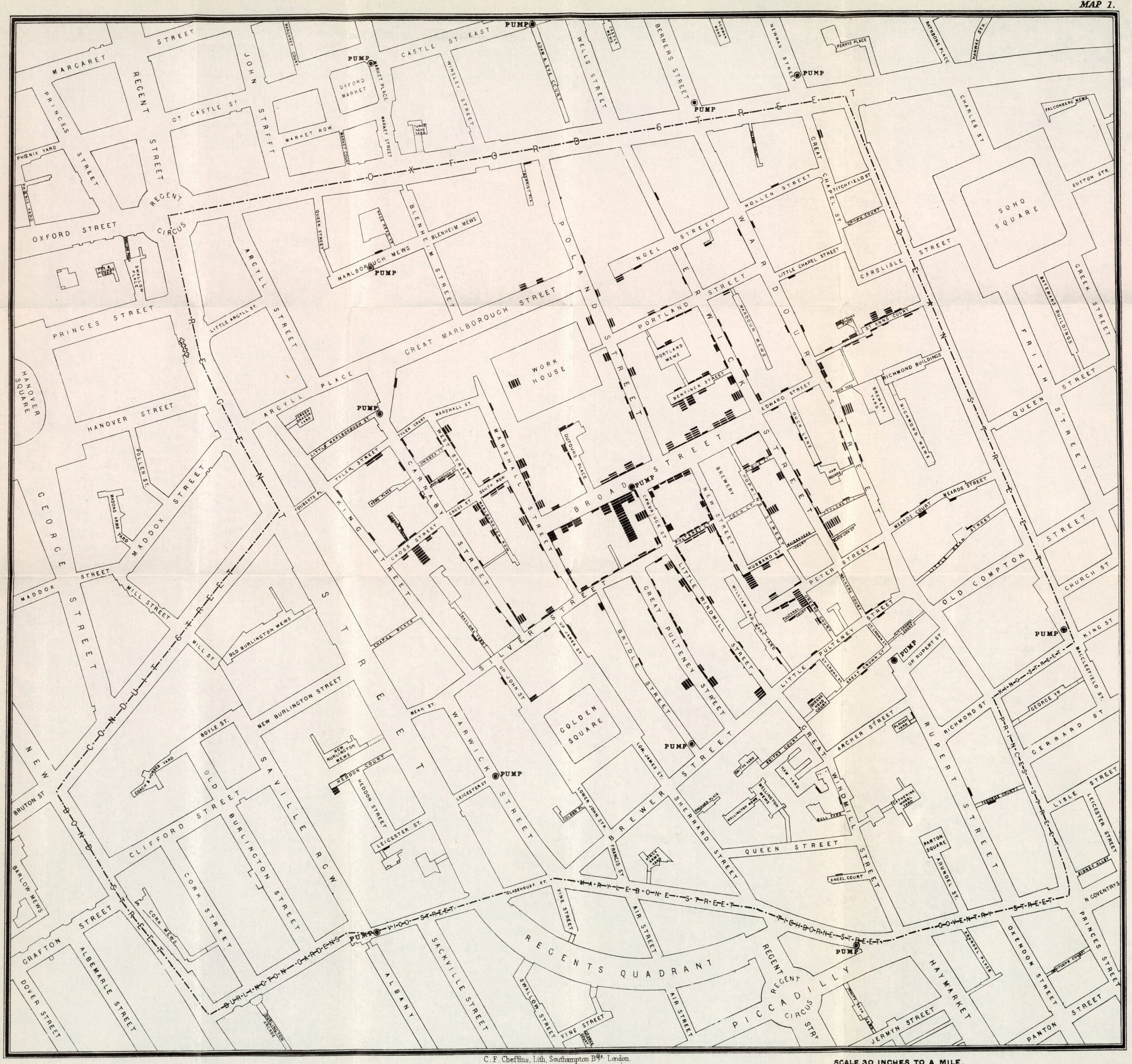
This map was published in 1855 by John Snow to show the correlation between the cholera outbreak that was afflicting the city and a contaminated water supply.
The map shows the Soho district of London, with water supplies (PUMP) marked on it, as well as the blocks where cholera deaths had been recorded. With this, John Snow was able to demonstrate that the majority of the 578 deaths were around a water supply on Broad Street.
This map is considered one of the earliest examples of how data collection techniques and cartographic representation can be used to investigate public health issues.
Sources

