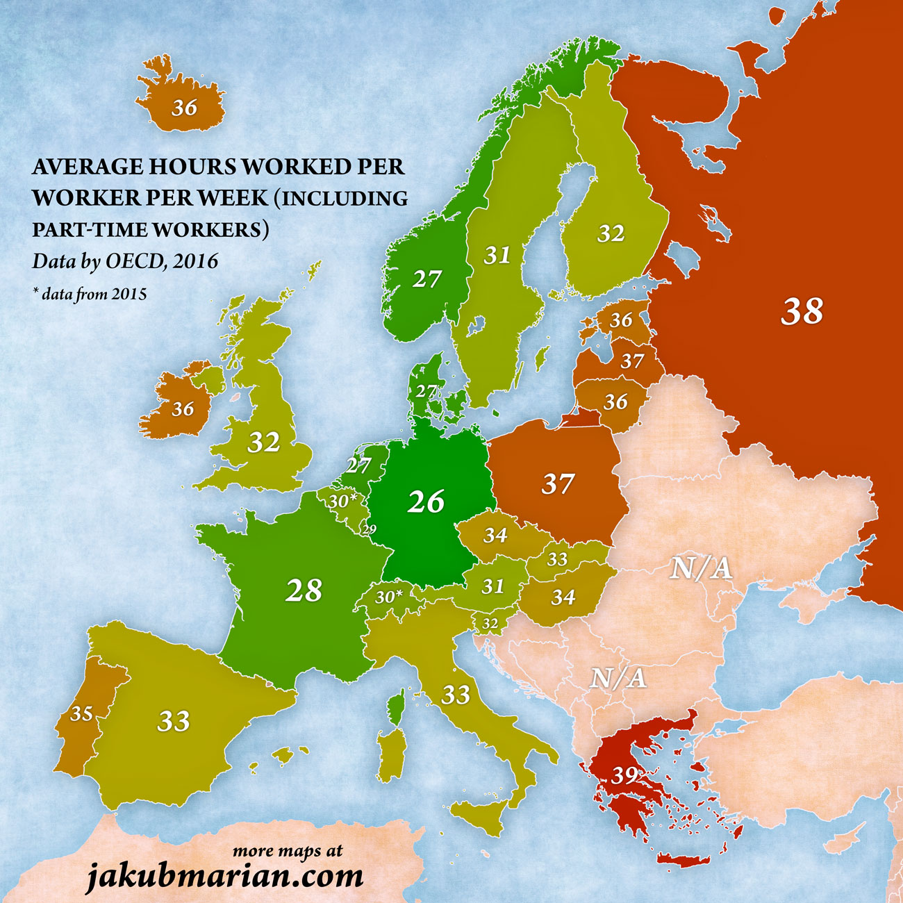
This map, created by the illustrator Jakub Marian, shows the average number of hours worked per employee in Europe over a week, based on OECD data from 2016. The calculation includes part-time workers.
To obtain the data, the total number of hours worked in 2016 was divided by the employed population in each country, and then divided again by the number of weeks worked.
It is not immediately clear that it is possible to determine whether more or fewer hours is better. A country with shorter working hours would see its number fall, but so would a country with a high level of part-time work (whether voluntary or involuntary).
In any case, there seems to be a certain correlation between a low number of hours worked per week and countries that have traditionally been considered to have a high standard of living.
It should be noted that these figures do not take into account hours worked but not recorded.
Sources

