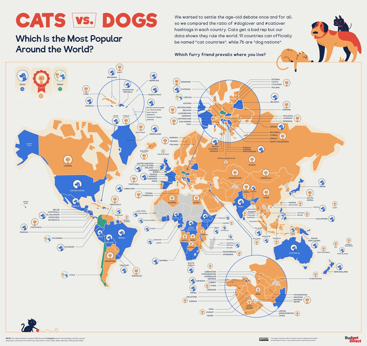
The map, created by Budget Direct in 2021, shows the preference for dogs or cats in the world.
The illustration is based on an analysis of the prevalence of hashtags on Instagram relating to dogs and cats, as well as the impact they have in each of the countries. The data is used to establish the different percentages in each country around the world.
Undoubtedly, the methodology may be questionable, but that does not detract from the fact that it is an approximation. And on the artistic side, the map is very neat.
Sources

