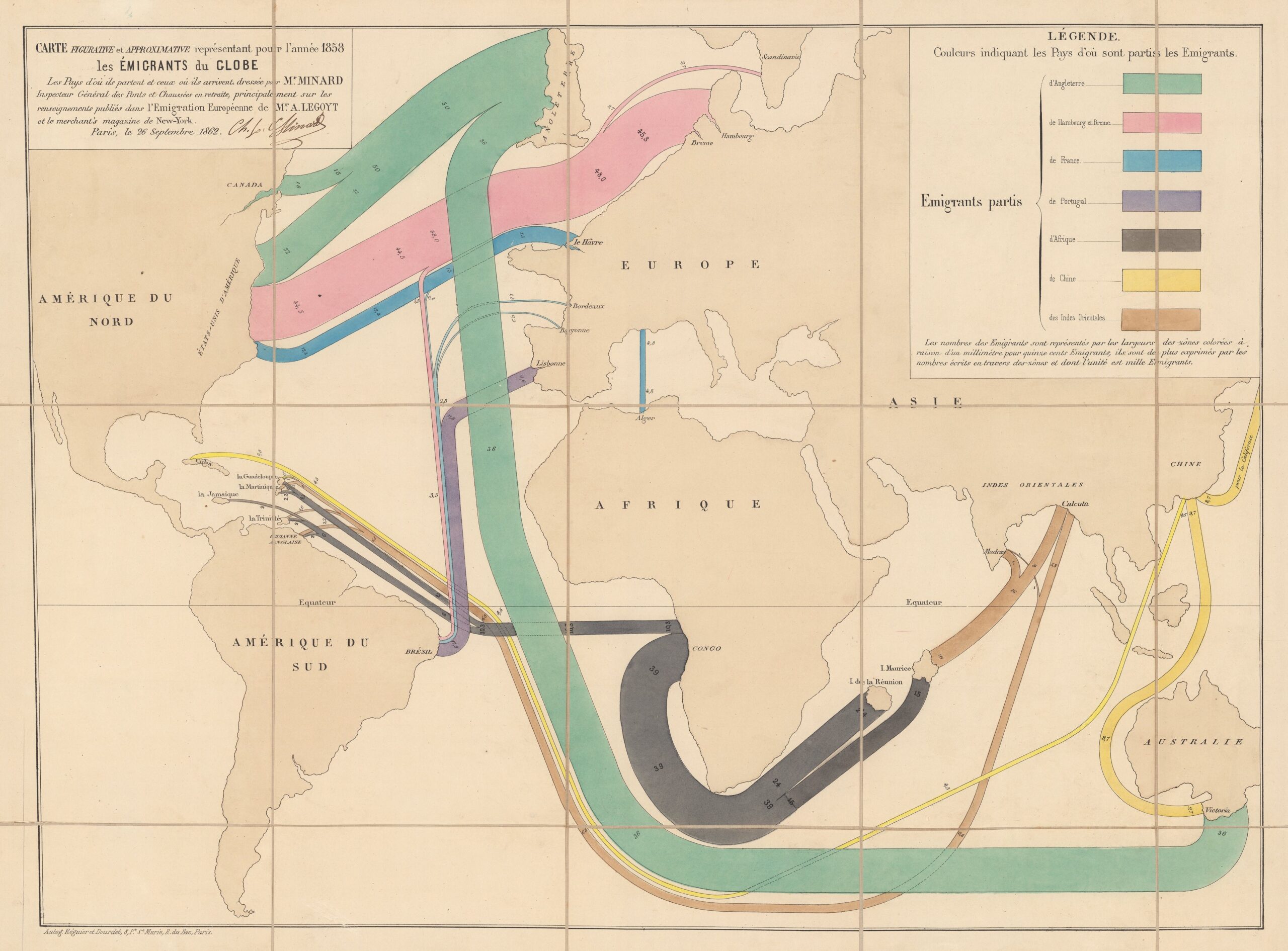
This map, published by Frenchman Charles Joseph Minard in 1862, shows an estimate of the main migrations in the world in 1858.
Charles Joseph Minard was a true pioneer in thematic maps and the graphic representation of information. Throughout his life, he produced more than 50 works of this type, among which the memorable representation of Napoleon's troops in the Russian campaign.
On this occasion, Minard's objective was to show the main population flows in the world. It is important to understand that access to data in the mid-19th century was very limited, so this representation is nothing more than a rough estimate. To make it visual, the author makes the thickness of the lines proportional to the number of migrants, with one millimetre for every 1,500 migrants, as described in the upper left corner.
For context, it is important to understand that this map was published shortly after slavery was abolished in Great Britain (1838) and France (1848). The colours represent the different countries of origin, which are:
- Green: England, with 86,000 emigrants heading for Canada, the United States, and Australia.
- Rosa: Hamburg and Bremen, with 48,000 emigrants bound for the United States.
- Blue: France, with 20,000 emigrants bound for the United States, Brazil and Algiers.
- Purple: Portugal, with 11,600 emigrants bound for Brazil.
- Black: Africa, with 49,300 emigrants bound for Guadeloupe, Martinique, Jamaica, Trinidad, British Guiana, Réunion and Mauritius.
- Yellow: China, with 23,000 emigrants bound for California, Australia, Guadeloupe, and Cuba
- Brown: India, with 22,800 emigrants bound for Mauritius, British Guiana, Trinidad, Martinique, and Guadeloupe.
As can be seen, the author places great emphasis on migratory flows to French possessions, even significantly increasing the size of some islands such as Réunion and Mauritius. In doing so, he seeks to highlight the importance of migratory flows to France and the significance of these economic and commercial hubs.
Sources

