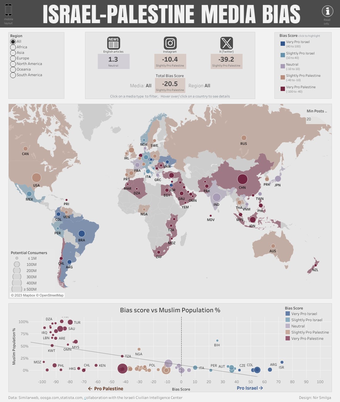
This map, created by Nir Smilga in collaboration with the Israeli Civil Intelligence Centre, shows media bias regarding the situation between Israel and Palestine.
Despite being a data map, the illustration has a significant propaganda slant, as it speaks of bias when in reality it is representing sentiment. Furthermore, the authors have decided to use negative values and the colour red for pro-Palestinian sentiment, with the resulting unfavourable connotations.
This map has been analysed in detail. in this article.
Sources

