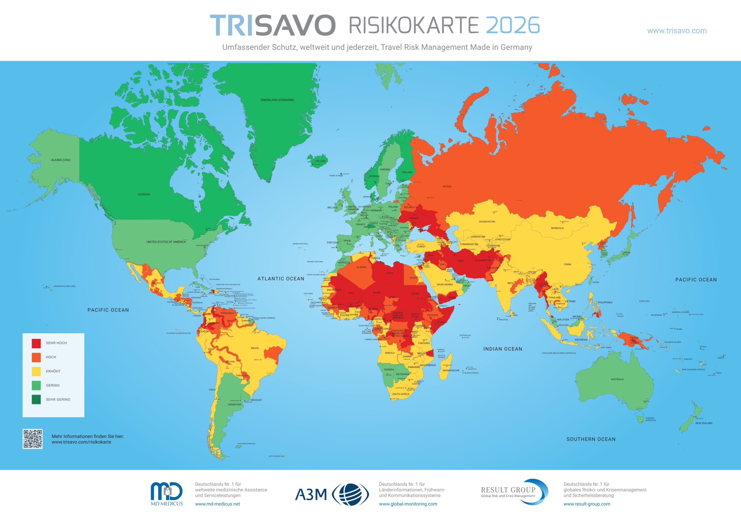
This map, published in 2026 by Result Group GmbH, a German company specialising in risk and crisis management, shows the risks for travellers around the world.
The map shows the different regions of the world classified into five levels of risk for travellers: very high (red), high (orange), high (yellow), low (green) and very low (dark green). The red areas include mainly areas actively at war, such as Ukraine, Libya, Sudan, Iran, Afghanistan, Yemen, Somalia or Gaza. It also includes regions with persistent and dangerous conflicts, such as much of the Sahel, the border areas of Venezuela, the Caucasus or Myanmar.
Similarly, it is curious to see how there are regions that are currently at high risk, but are depicted in orange (such as much of Russia), yellow (such as Israel) or green (such as the United Arab Emirates). This is explained by understanding that the map, while presented as a risk map for travellers, supports an advertising campaign by Trisavo, Result Group's travel risk management brand for businesses.
Result Group does not publish the methodological criteria for each colour in each country, as its objective is not directly the dissemination of public information, but to serve as a bait to contract corporate services to large companies. This map is mainly a showcase to attract new clients: international companies that have to evaluate where they can send their workers and under what conditions.
Sources

