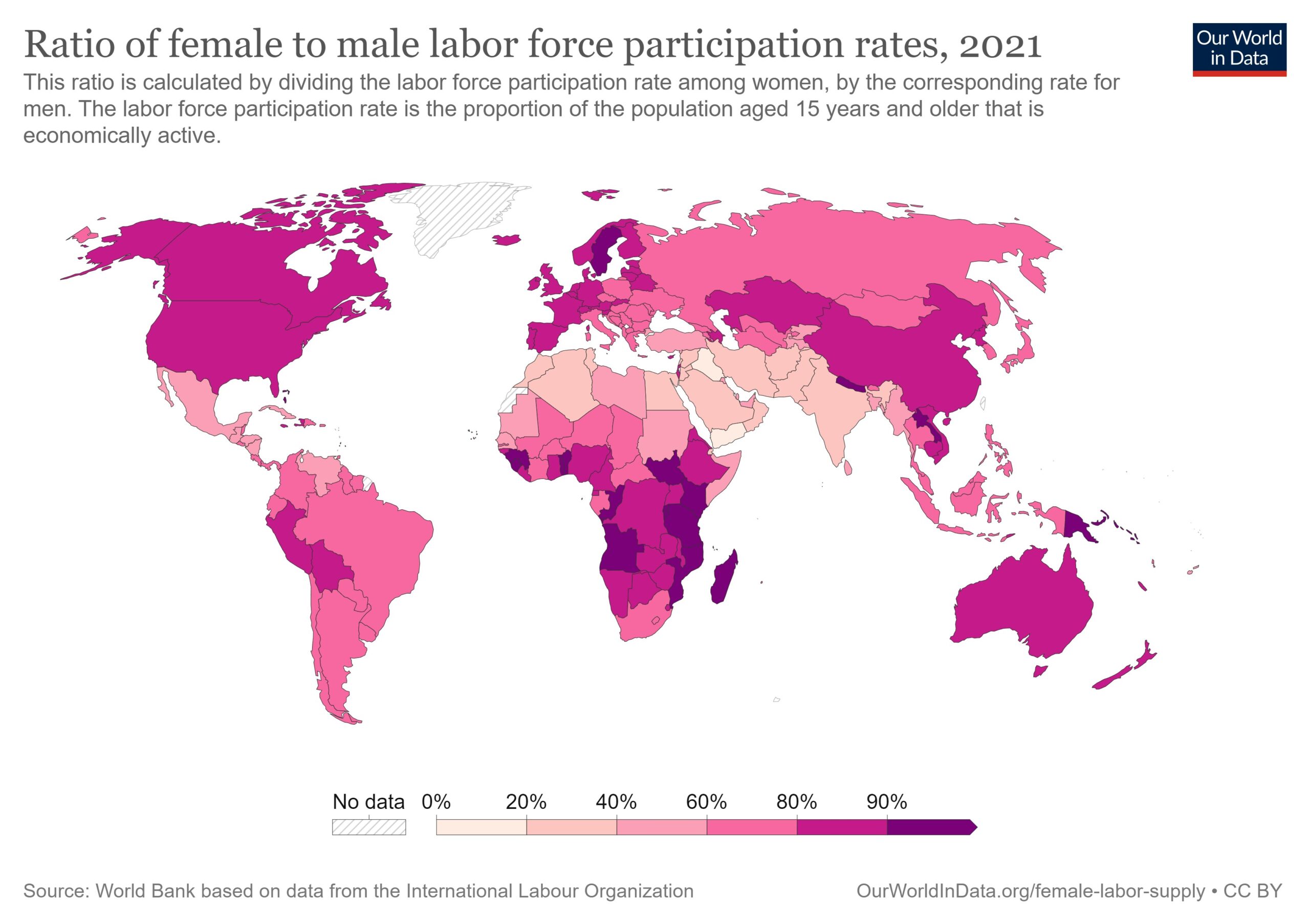
This map, published by Our World in Data, shows the situation of women in the labour market and the differences between different regions and countries around the world.
The ratio establishes the relationship between the percentage of women over the age of 15 who have entered the labour market and the percentage of men. The darker shades show the countries where this ratio is similar and, therefore, the number of women and men in the labour market is practically equal. The lighter colours show where this difference is most pronounced.
Only in three countries in the world is the ratio of women entering the labour market higher than that of men: Burundi, Rwanda and Sierra Leone.
At the opposite end of the spectrum, we find Yemen, Iraq, Iran, Jordan, and Syria.
Sources

